Client: Home Depot
Website: corporate.homedepot.com
2015-2023
Position: Lead Front-End Developer / Lead Maintenance Developer
Tech stack: Drupal, Grunt.js, Google Cloud (Updated later to Docker, Pantheon, Gulp.js)
Initial Dev Time: 3.5 months
Overview:
Few businesses have the resources of The Home Depot. They are (#33 on the Fortune 500), and as of writing, this employs 371,000 people across 2,274 storefronts and multiple offices. In a word, The Home Depot is massive.
Role:
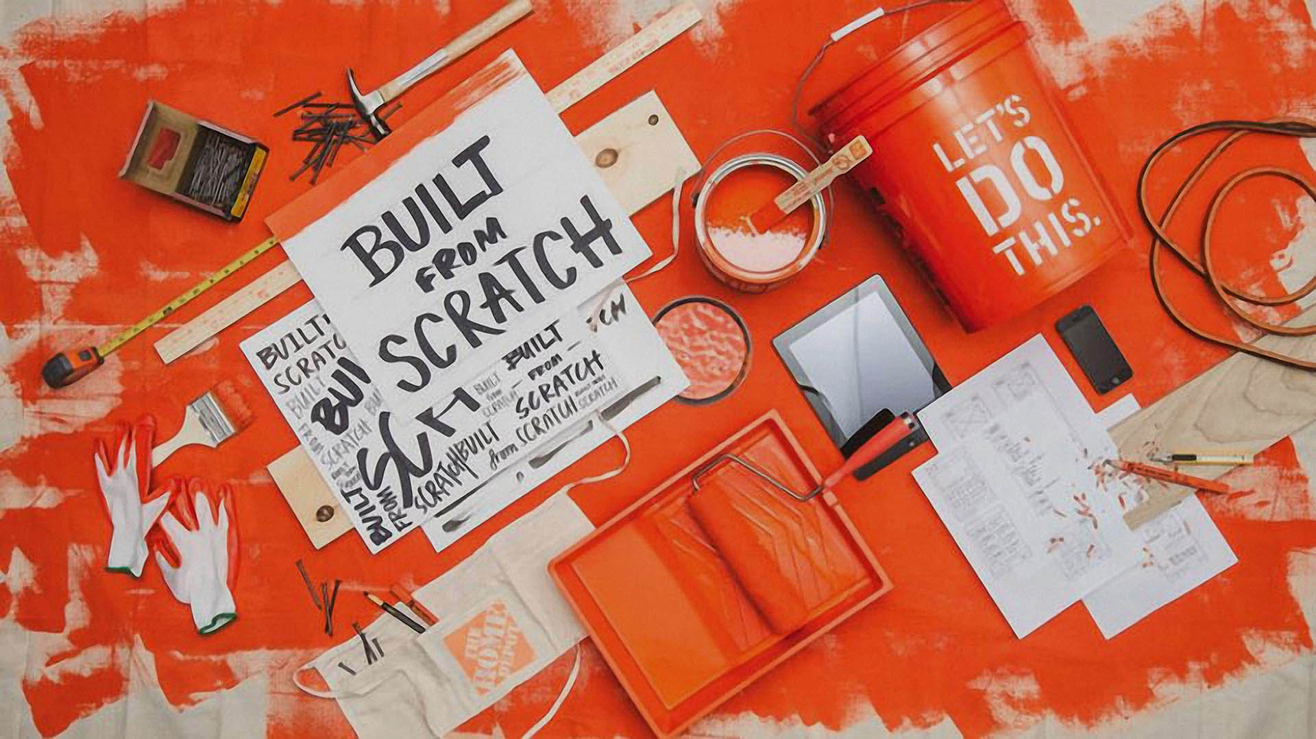
Emerge Interactive partnered with The Home Depot's corporate team, which involved trips out to their Atlanta corporate office, where Emerge's Creative Team was able to flush out and finalize our designs. Home Depot looked to depart from the minimalist trend, to capture The Home Depot's Built From Scratch look and feel.
 Pictured: Version 1.0
 Unique Challenges:
Under The Home Depot's brand, they have several sub-properties, chiefly its "Team Depot" (outreach) and "Built From Scratch" (media). One of the unique concerns was how to move all the concurrent media channels into one seamless space; aggregating its social media streams (FaceBook, Twitter, Instagram, YouTube, Vimeo), media outreach and charitable causes. This included moving its previous website's content to the new website.
With an entity as large as The Home Depot, accessibility was a chief concern. Our accessibility testing included matching to the A11y standards for contrast, screen readers, mouse-less navigation, fallbacks for when JavaScript is disabled and legacy browser support (IE9, iOS7). The long tail support meant eschewing some tools like Flexbox, and latest Javascirpt to ensure maximum compatibility. The client also had content previously developed for their old web property such as Hype 2 animations, not all of which were initially responsive which required tweaking to fit into the new responsive website.
Pictured (above): Example of a tab-index return fix to deal with the complexity of the slide shows and limitations of our CMS developed for Home Depot
As a personal objective, I set a hard limit of 600k of non-CMS assets as the site is incredibly image-intensive. This included any image/JS/CSS/fonts that served as part of the template. It's easier said than done, especially considering the original design and the world of Drupal, which packs quite a bit of its own necessary resources. I obtained this through a barrage of front-end patterns, such as minifying JS and CSS assets and creating my own "Bootstrap-Lite," cutting out roughly 85% of the Bootstrap code to avoid redundancy. Also added to the mix was a larger breakpoint for larger screens. The end compiled CSS ends up weighing at an astonishing 31k when served through GZ compression, and the entirety of the JS from the template (non-CMS) is 17.5k (excluding jQuery, required by Drupal). The most significant gains to be had were on the template imagery side.
Pictured above: It's often advantageous to roll-your-own with common simple UI elements like accordions to ensure lightweight code and simplicity. This simple accordion menu takes only ten lines of javascript before minification, which comes to 305 bytes minified.Editing the images meant revisiting my digital arts degree creating repeating texture maps from the design I was given. I was able to shave off precious bytes without sacrificing the visual integrity of the original design. In the end, I saved hundreds of precious kilobytes off of individual textures.
 Pictured (above): 1500px x 300px (2x version) texture was for the header, 2x.
 Some of the more inventive solutions came from the mother of all inventions: necessity. The Home Depot wanted to leverage modals. Not just modals for images but modals that contained slideshows, videos, and downloadable images. Today we have the luxury of <dialog> but in 2015 we did not. The content contained in these modals also needed to be CMS managed. A single page could trigger multiple modals. I need to stress that they really liked modals. (Some battles just cannot be won.)
As I mulled this problem over, I hated the idea of polluting the DOM with so many modals and burdening the browser with senseless requests. I decided my path would be to leverage a single global modal that would be populated only at the point of interaction. This presented another problem; I needed to be able to trigger sets of images from a single line. Thus, I arrived at a surprisingly elegant solution: make the CMS spit out the code in JSON into data-attributes to be interpreted by javascript. The modal trigger fired a series of events: acquire the slide data, write the slide data to the modal in the DOM, and finally show the modal. Closing the modal did the inverse, hiding the modal and destroying the data that had been written into the DOM.
What made this project work was the extremely tight team, consisting of Christa (Project Manager), Dan (Lead Back End Developer), Mike (tech lead), Adam (Designer), Daemon (Creative Lead), and myself as the lead front-end developer. Due to the timeline, all interaction animation design fell on my shoulders.
The Future
With a narrow dev window, we were able to accomplish what, at times, seemed the near impossible: creating a site that houses thousands of images and hundreds of articles all across multiple templates. We launched on time to meet the quarterly earnings deadline. We also landed a service agreement retainer contract where I continued to work as the lead front-end developer for seven years. There were many updates over the years, like moving our development to Docker, ditching Grunt.js for Gulp.js, switching from Google cloud to Pantheon, keeping up with security updates, upgrading from Drupal 7 to 8 to 9, replacing social media functions and integrations.
Milestones
During my time as the main developer responsible for meeting the client's requests, the site grew from 100,000 page views to 500,000 page views and kept a 99.9% uptime, thanks to Pantheon. As of writing it still exists in the same format as it did before.
 LinkedIn
 GitHub
 Blog
Blog